Marisa Fernandez


In the butterfly graphic artwork, the artist uses both straight and curved lines to convey movement. Many of the lines begin at a central point beneath the woman’s neck. From there, straight lines expand outwards, creating an outline for the butterflies. Along the top of the image, a curved line creates a soft, flowing outline for the butterflies. This gives the butterflies the illusion and sensation of hair. The artist uses asymmetrical balance by placing the butterflies more densely on the left side. This is done to balance out the woman's face, which is on the rights side. These lines convey emotions of calm, peace, and fluidity.
In Michelangelo's most famous panel from the ceiling of the Sistine Chapel, we can see he used various types of lines to guide the viewers eye. Adam and God make eye contact, with a straight, diagonal line. The angle of the line gives us a sense that God is positioned above Adam, looking down on him. While their eyes meet , there is much negative space between the two of them. The negative space is interrupted by the touching of their hands. This continues the balance of Michelangelo's work from left to right. By breaking up the negative space this way, Michelangelo brings the viewers eye to their meeting hands. From there, the viewers eye follows lines outside of the center.


Unity With Variety
Symmetrical Balance


Continuation
Proximity


Asymmetrical Balance
All Over Pattern

Asymmetrical Balance By Position
Asymmetrical Balance By Shape


Radial Balance
Repetition


Asymmetrical Balance By Texture
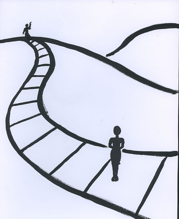
Balance By Eye Direction


Neutrals: Each primary color on the left is paired with it's complimentary color on the right. As the primary colors mix with their compliment, the color becomes closer to a neutrals, brown.
Color Wheel: The largest blocks are primary colors, the second largest are secondary colors, and the smallest blocks are tertiary colors.
Collage Project 3/29/17


Black and white tones made from magazine paper.


Although the rectangles in the center appear to be different shades of blue, they are actually the same color. The blue on the left makes the center lighter, while the yellow on the right makes the center darker.
Although the rectangles in the center appear to be the same color, they are actually the different. The center rectangle on the right is actually the same color as the small rectangle on the bottom left. Similarlly, the center rectangle on the left is actually the same color as the small rectangle on the bottom right. The purple background on the right makes the color lighter, while the yellow background on the left makes the color darker.
These rectangles appear to by overlapping and creating a transparent color.


4-Up Texture Medium
Pattern & Texture

Optically Mixed Portrait
Alber's Experiments
Color Theory
Collage
Color Wheel
Rhythm
Balance andUnity
Story Board
Shape Series
Line Analysis
Emotional Line Drawings

Bezold Effect


Stamp Project


Triptych
Each of cell displays different scenes yet communicates a larger story when looked at together, typical of Triptych artwork.
